Reflective Summary

14 May

My reflective summary for this module was an overall good experience. I liked how as a team we were able to bounce ideas around to get a stronger concept. Personally, I wished that this module had started in the getting in term 1 as it would have given everyone more time and people wouldn’t be rushing around and would enabled us to balance the work for other modules out.  This subject broaden my skills and allowed me to learn new techniques such as printing and book binding.

Involving myself in a group task enabled me to get involved and intrigued in a project that will conceptually be strong as will have ideas bouncing around. As they stay, two heads are better than one.  I attended meeting and gave feedback upon people work and how it can be approved. As being the member of the production team, we all decided on the paper type, the sizing, the sort of printing, printing quotes etc. All this information, was given back to the group so all they can have an insight upon the subject matter. One problem that I would stay is that, people were set tasks to complete but people was crossing over each other and doing the work. At the end of the day, it can be seen as a waste of time because that time could of been focused somewhere else or upon their designs.

Despite that, the overall experience in designing the book was interesting. As a group, I would say that we produced a strong visual and creative concept with some outstanding work. With some of the work, simplicity was the best way forward.  If the module had started in term one, the final result would of been a lot higher and have a lot more potential within in and would of given external contributors more time to design something for the brief.

My future goals and ambitions is to start of own design company or be a freelancer. This module has made me see potentials within my work and how I can improve my designs conceptually. It been a learning experience and an experience that I happy that I took forward. Everyone got to start from the bottom but once I have enough experience, I will have my own company. Everything is due in due time.

The skills that I have learnt from this modules is how fun and motivational it is working in groups as it bring out ideas that you didn’t think from others. I also become a fan of using Indesign for type, presentations, books and layouts as it allowed me to practice a lot with the program. The final stage is waiting to see what the final outcome of the book will look like but I personal would of preferred if the book was a lot bigger.

SWOT Analysis

14 May

Strengths

  • Keeping in constant contact with the group via Facebook in which everyone was able to a get feedback upon there work and via versa.
  • Worked well all together as a group and everyone was motivated and focused in creating a good result result for this project.
  • Attending meeting to keep or track of the project and see any further developments and issues that needed discussing.
  • Finding out vital information. For example, the cost of printing etc.
  • Learnt new skills and techniques for printing.
  • Different concept design styles enabling the book to not look boring.

Weaknesses

  • Not everyone turning up to meeting
  • Task being set to a person and someone else doing it.
  • Some designs for book should of been hand in before as it would keep everyone more to focus on the layout and format of the book.

Opportunities

  • A portfolio piece that can be shown to future employees and clients.
  • A book that can be shown to future designers attending the university.
  • Good opportunity to have a piece of worked that people on your course had all contributed to. A remembranceof fellow designs that people have known for 3 years.

Threats

  • Not having any funds from the university to fun the printing.
  • Being told the work isn’t good enough or if it was up to them, they wouldn’t have it within the publication.
  • The styles of outsider/external work; if it didn’t fit with the style and concept of the book, it wasn’t included.
  • The meaning of the quote not being understandable, had to be changed as someone didn’t understand it compared to others.

Final Spreads

12 May

For this modules,  the final 3 spreads that I created for the publication are below.

Stefan_Barretto_Quotes_1_Spreads Stefan_Barretto_Quotes_2_Spreads Stefan_Barretto_Quotes_3_Spreads

Final Major Practical Project

7 May

After a long, stressful year, major practical project is finally coming to a close. It has been very enjoyable and I learnt new skills and technique through this process. Below are the deliverable requirements for this assignment.

Presentation

Cryptic Ace Apparel Branding Guidelines

Cryptic Ace Apparel Website Link

Major Project Brief – Stefan Barretto

Website: www.crypticaceapparel.co.uk

Logo

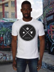
Cryptic Crest Logo

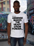
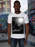
T-Shirt Design

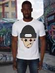
Hat Designs

Last Minute Change

4 May

This slideshow requires JavaScript.

The images above shows the designs before last minutes changes were made. The quote text had to be changed to make it shorter but have the same meaning towards it.

The new quotes are:

1. design is rewarding, but a time consuming practice

2. determination grows from the roots but doesn’t always flourish

3. creative criticism is rewarding when you reach the top


Quote 1

design is rewarding, but a time consuming practice

When speaking to the lecture, she asked me to do a few changes. First it was the choose of font and secondly she was confused whether i was portraying post-note or a note stuck on the wall because the pin portrayed something different. After understanding her point, I developed the post note to look more of the shape and emphasized more upon the colour.  After mucking around with the layout, positioning, font and text size, I was finally happy with the outcome. It was a lot more effective, stronger and clearer.

Stefan_Barretto_Quotes_1_Spreads

Quote 2

determination grows from the roots but doesn’t always flourish

The changes to be made for this spread was the layout of the text. The image below shows the changes I made.

Quote 2

From the image above, you can see that I made the text size bigger and centered it but also changed the kerning so that the font wouldn’t look cramped.  As the quote explains that you will get determination from the bottom and proceeds to the top but there be set back; the 2 lines emphases the journey going from bottom to top and in the middle the quote is stated.

When I showed this developed to my lecturer, she stated that maybe you should swap the images with the text and change the direct of the lines so that it flows out of the side of the page. By this, the text will reflect upon the image a lot more. The image below shows the change.

Stefan_Barretto_Quotes_2_Spreads

Quote 3

creative criticism is rewarding when you reach the top

For this quote, there was no need for changing the image design but following the same problem in quote 2, the text and layout needed changing.  The image below shows the final outcome.

Stefan_Barretto_Quotes_3_Spreads


Final Cryptic T-shirt Designs

3 May

The requirements for this brief was to design 10 t-shirts designs. I did an additional 2 more designs. The images below shows the final designs.

Designs Incorporated onto Clothing

1 May

The images below the shows the t-shirt desigsn incorporated on clothing.

The images below the shows the hat designs incorporated on clothing.

Third Spread

23 Apr

For my final spread, I decided to create a mixed media piece. I am going to be working on the quote “Love that digital design is creatively challenging but hate its time consumption but the end result makes up for everything” which will consist of a train moving through a open field with a clock on the front. The reason I choose to use a train was because in society trains can been seen and used a fast and slow use of travel up and down the county compared to the use of cars. On trains, depending where your destination is, you are able to see different views of landscapes whereas in a car, all you see is the never ending road of a motorway.

The sketch below shows the initial concept. photo

As it was a mixed media piece, I broke down the elements into which I will draw certain selections and use various forms of media to enhance it colour and toning before placed into Photoshop where it will be manipulated to fit the layout as seen in the sketch above.

Below are the images I drew and using different techniques to get different styles within this piece of work.

photo(1) photo(2) photo


IMAGE OF THE DRAWING.

The image below shows the final outcome.

2

I was quite pleased with the overall outcome of this design but felt that the train seemed to blend and get lost within the concept. Despite that, all the elements worked hand in hand together. The next step for me was finding a place for the quote.
After experimenting with the layout and positioning of the text for the quote, no where seemed to of worked even when the colour was changed. The only way that, I will stand out was by having the quote in a shape, as this will separate the elements from one another.  As it was a mixed media piece, I thought why don’t I have it as a post-note pined to the image. The image below shows this as well as the alteration so that the trains stands outs.

Quote 1

I liked the final outcome of this design. It was clear and visible. The quote in the form of the post-note worked well as it was its own element and the use of the shadow enabled it to give it a realistic look.

Second Spread

16 Apr

The second spread that I am going to be working on is “I love how determination comes from the root of the soil and blossoms but I hate that bad weather can cause a setback“.  This quote is abstract but it is self explanatory. What the concept is going to be showing is that ideas coming from the bottom and developed to the final stage but the end result always leads you back to changing and altering elements within the design. To reflect upon the quote, I am going to use the concept of a tree and how it flourish and the cause the set backs, it will be shown via the branches of the tree; on half being dead and the other half being blossomy.  The sketch below will show the how the idea will be illustrated.

photo(1)

I the look this idea into Photoshop and started creating the concept. As this was going to be a manipulated image, I looked at and used images using the artist permission.  The image below show the final design.

Human

I was very intrigued and impressed with the final outcome of this concept. It was simple but effective but still with the abstract twist on it. The texture background gave a bit more depth towards the image instead of it being bland and plain; it enabled the audience to focus entirely on the image in the middle.  When presented this design to my colleagues, they were all please and was happy with the outcome and didn’t recommend any changes.


Dreamweaver Pop Up Message

16 Apr

Picture2

When the user click enter on the index page, a pop up message will appear stating that the site isn’t fully launched yet, so purchasing products will not be possible but they are still able to view the site and see what is available.

The screenshot below shows how I did this using Dreamweaver.

Picture3